I recently came across the work of Liz Hernández, a Mexican artist now living in Oakland, California, who works primarily with topics related to her identity. She pulls imagery from her memories of living in Mexico City, focusing on the way the mundane and the extraordinary coalesce. Recently her work has been inspired by the idea that food is a language that we can all understand. She explores food as a way to communicate ideas of immigration, community, and home.
I was instantly pulled in by her red and pink Market Signs series where the colours alone demand attention and after learning of her inspiration, I was even more intrigued. I sent her an email asking her about the series and here is what she wrote back:
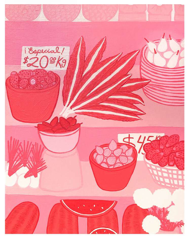
Cartulinas del Tianguis - Comemos por los ojos. (Market Signs -How we eat through our eyes). Acrylic on Canvas. 28 x 40 Inches. 2019
“The pink market series are an exploration of the Tianguis, the name given to the itinerant markets that fill the streets of Mexico City. The markets are deeply tied to their pre-Hispanic roots and have become a key element of the city’s cultural identity. Most people can relate to the experience of going to the mercados, and even though CDMX is strongly divided by social class the market brings people from different walks of life together: from famous chefs looking for their next challenging ingredient, to families simply buying food for the week.
The market travels around the neighborhoods of the city and pops up in the middle of the streets, often taking over entire city blocks and flooding the streets with their striking pink tents. They are unique in their spontaneous appearance – they cut through the city’s pollution and chaos with their unmistakable pink color that says ‘we need to be here, and we need to be seen’.
The experience of walking through the market is otherworldly, it is full of stimulating sounds, a variety of contrasting smells, and teetering on visual overload. The vendor stands take a unique creative liberty in the display of their products – mangoes become cut shapes like roses, pineapple slices are stacked like bricks, signs are less formal and transactional and more personalized with humor – (they want to tell you what they are selling but they might want to tell you something else!) all washed in soft pink light.
In Mexico the popular phrase Taco de ojo (Eye taco) is an expression used when we find something appetizing (it could be food or a person). This makes me wonder if the reason behind the vendors’ creative arrangement is a deep understanding that if we want to eat something we have to do it through our eyes first.
The pink paintings aim to show the experience of stepping into the market within the bustling city, and feel yet so far removed that it becomes a self-contained world, a privilege to those who exist in that space. The pink tents become a safe haven from the fast-paced life, a place where time moves slower and where you find yourself washed in the pink hue that has the power to ground you again. My goal is to portray these markets as a place where food becomes an expression of artistry, and where you can find magic in the mundane.”
Let’s take a look at a few of her pieces from the series, along with other works (and contact info below).
Crisantemos, Tunas y Flor de calabaza en el Tianguis. (Chrysanthemums, Prickly Pears and Squash Blossoms at the market). Acrylic on Canvas. 28 x 36 Inches. 2019
Cicatriz #1 (Scarring #1). Mixed Media 6.5 x 3.5 Inches. 2019
”Market Study #3” Vinyl paint and oil stick on wood panel 11 x 14 inches 2020 - part2gallery.com
Facebook Mural - Facebook Artist in Residence
”Market Sign #8” Acrylic on panel 11.5 x 11.5 inches 2018 part2gallery.com
Below, Hernández’ most recent work —Small works on paper for the Friends & Family show at @hashimotocontemporary These pieces are inspired by their time of isolation, and by cooking a lot and walking around seeing the flowers blooming in Oakland.
Jan founded Poppytalk in 2005 while a student at Emily Carr Institute of Art and Design (now ECU) to catalogue inspiration from typography to interior design. Since then she’s collaborated with Target (creating a limited edition glamping collection), a wallpaper collection with Milton & King, as well has written as a contributor at Wired, Martha Stewart and Huffington Post.